Greetings from all over the world! Aren't these post cards super unique and fun? I think so! I made these to teach myself how to create creative and exciting postcards for future use! Now whenever i need a postcard I can make my own personal styled postcard. I made them in photoshop and used many different techniques to change the look of all three of them.
I chose to do Chicago because I love Chicago and I want to go to school there and eventually live there. I then chose Christmas because winter is my favorite season and Christmas is my favorite holiday. I also did Hawaii because I have always wanted to visit there.
These were super simple and quick to make and I really enjoyed making them! They taught me about layering and adding specific detail to make my postcards super unique and special!
I filmed a live broadcast of Olathe Northwest's annual blood drive. It was an interesting experience and had many stages throughout the process. Olivia Contractor, a Sophomore at Olathe Northwest, had many struggles through the process of donating and had a long journey to donating.
In order to get the shots that I wanted I had to follow every step, camera in hand to make sure I didn't miss a moment! It was more difficult than you would think to film steady without a tripod and took a lot of focus and concentration. Along the way I picked up a few tips and tricks to make my video even better than before.
I would've changed a few shots but when filming live footage you just gotta keep going! I feel that this was a successful story on the blood drive and was an exciting event to film!
When we are young and tiny, building legos is a fun and exciting activity but as we get older we forget the fun things we did as kids. Olathe Northwest brought back the joy of building legos and had a group of high school students build different sets of legos to bring back that childhood-feeling.
When filming the process of building legos, I wanted to make sure that I captured the joyous feeling of putting each piece together. I shot the length of the process by adding different shots and angles to create an interesting view on the video.
If I could change anything, I would try to capture better audio to hear his comments on the childhood-feeling comeback. I feel that I did the best I could and that this video could indeed be better. It was fun to see the legos be created and the joy in the students eyes come back.
I really liked this project. It taught me useful tools that I know I will use in the future. I liked learning how to create a shadow and move it to a different background. I really liked being able to be myself and use things that I like. Learning how to extract items will be very helpful for future projects and assignments.
This is the mountain that I made float in the sky. We were to extract the mountain and embed into the sky background. I first started out with carefully extracting my mountain so that it would look the best that it could. I learned many things that will help me in the future such as, how to use the quid selection tool. This is a tool that i will use in many projects and will be very useful in the future. I would do all of it the same as i did this time. I would maybe add a few more things just to make it my own and unique. I will use this to create amazing projects. I really enjoyed this project and i am excited to use these tools in the future.
This is my sphere that I created in Illustrator. I really enjoyed this assignment because it taught be how to create spheres that are unique and useful. I learned how to apply a 3D effect and add a star to add detail and originality. I struggled with creating the sphere and making it how I wanted it to look. I really like illustrator and it was easy to learn how to do this.
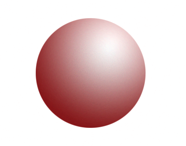
This is my red sphere that I made in illustrator. I liked using illustrator better because it was easier and much faster. This was much easier to create in illustrator and a lot more detailed! I learned how to make a shadow and how to make it appear as if there were to be a light source shining on the sphere. I really enjoyed this!
This is my red sphere that I made in photoshop, I really don't like photoshop but this wasn't that hard. I learned a lot that will help me in the future. I learned more shortcuts and new techniques that will make projects easier and faster. I also learned that spheres are in most everything i will do in graphic design and they are a vital part of the process!
This is a music video that we made in my video class. The scope of this project was to create a music video that was a minute and a half long. We first had to come up with what song we wanted to do and the story of the video. We then created a storyboard of all of the shots we wanted. I learned that in order to work as a coherent group, you must listen to everyones suggestions. I would probably not have done this plot with this song if i were to redo this. I would still create the suspense and tone of the story. Finally, my thoughts throughout this video were that we had a good story and good song but our shots could have told the story a bit better.
My logo represents me because it shows a fun, cheerful, and happy view on life. My process of creating this logo is to start with the image I wanted to portray. I wanted to show that I am happy and upbeat and enjoy doing the things I love. I then started with a flower shape and added color. Once I realized I didn't like that then I added to it and started with an ellipse then rotated copies of that shape to create the base of my logo. I ended up with the flower/sun shape and I really like it. I learned how to make shapes that are not provided and how to incorporate myself throughout the logo. I think I did a really nice job or representing myself and showing my personality and attitude. I think I would change the detail of it and add a little more detail to it. I need to work on the way I create logos and not just jump into the design phase.
When making my font I learned many things such as how to edit a specific letter or part of the font to really make it my own. Something I did really well is that I used color and effects to create a different look and to make it original. I would probably try to do a little more detail and a little more life. I want to learn how to make a grass effect and be able to use it in an easy and efficient way.
When looking at the Google logo I notice many colors and a simple font. The colors represent a fun, calm, and smart theme for the entire website. The red represents excitement and passion. The blue represents peace and stability. The green represents environment and safety. The yellow represents cheerfulness and joy. Google wants to be represented as a universal website and wants to be used around the world. The font is a simple font used to represent the easiness of google and that it shows that anyone can use it.
This video was about a girl who was getting chased and stalked and how she had to get away. We wanted to try to be creative and come up with unique shots. It was an ABAB sequence. This was challenging and helpful for many reasons. One reason it was challenging was that we had to have many shots and they had to move within only a few seconds each. Another thing that was challenging was how to get creative with shots. This was helpful because it taught me how to utilize my surroundings and come up with different shots. If I could change anything I would retake a couple of shots and correct the lighting in some shots. I would keep the story and the way we got from one place to another. We spent many hours filming and editing to make this video the best it could be. I learned that sometimes shots look different when shooting them then when watching them. I thought this was a great project and I would definitely do it again.
This font is called Universal and it represents me in many ways. It represents the way i am creative and someone who enjoys to have fun and who wants to express herself through different arts. The fact that this font is all capitalized shows that i am outgoing and likes to meet new people. The soft edges showcases my calmer side and shows that i can be serious and passionate.
In this assignment we had to make a 10 shot sequence video. We had to get one person from one side of the building to the other in 10 creative shots. We were given the shots we used. The shots we used were close-up, medium, extreme wide, point of view (POV), over the shoulder (OTS), and wide. Close-up shots are shots that a very close to the object. Medium shots are shots that are waist up. Extreme wide are being able to see the entire background and object in the shot. Point of view is the camera shot from the objects perspective. Over the shoulder is a shot that is behind the object but still being able to see the scene. Wide shots are shots that are whole body shots and being able to still see background. What I learned from this assignment was how to set the tripod and camera to fit the shot that I needed. It was a little difficult to make sure the camera was in focus and the white balance was perfect.
In this assignment I took away three things. One, shortcuts to make my life easier and to make the process of creating these things quicker. Two, different ways to make each item creative and unique. Three, how to create evenly proportionate shapes and images to create a bigger picture.
I created two jars of peanut butter and jelly because everyone knows that they go together. They would be nothing without the other.
I created this pencil and pencil holder to showcase my favorite color and patterns.
I created this pencil and pencil holder to learn how to create the images so that i could continue to make more and edit them in a unique way.
Graphic design is in everything we do. Everywhere we go and everywhere we look we will most likely see graphic design. Graphic design is in the products we buy, the posters we see, and even the way we talk. Graphic design is a communication that applies to anyone and everyone. It is a way we can express ourselves in words and in images.