Thursday, May 21, 2015

Nothing but Net

Airball is a fun, light-hearted short film that proves that hard work and determination can solve and achieve anything. Meet Ryan, a skinny slightly awkward guy who just wants to play basketball with his peers. When Blake comes along and discourages him into not playing. Ryan gives up but it doesn't take too long for him to get back up and continue to get better. In order to come up with this story line, my team and I had to brainstorm ideas that we thought would be good short film stories. Once we got the idea we ran with the script writing and storyboarding. This was a bit longer process as we wanted it to look the best that it could. After completing both of those things we then came up with a time management schedule and costume list. When we were finished with all of our prep work we began filming. Filming took 5 days and multiple hours but ended up turning out great.

After the filming process, we started editing. Editing is a time consuming, slow job that requires patience and time. You must find the right music you like with the film and make sure the audio is at the right levels with the music and whatever sound effects you might use. Once I was done with editing I started to think about all the things I learned throughout the process. A big thing I learned was that time management is a huge part of filming anything. If you get behind it is very difficult to get back on track. Luckily, we didn't have any teamwork problems. We all got along and worked well together, contributing our own skills we each have. We did meet our deadline but only by the hair of our chin. This made the editing phase stressful and chaotic.

If I could change anything about this film I would change the time we got to film and edit. Unfortunately we had some troubles with our set and couldn't film for about 3 days. This made it difficult to finish on time and thoroughly. If I could make something stay the same I would stay int he group I was in as we got along and problems solved together and I would keep the story that we had. It was a fun story that I think people enjoyed. As an experience as a whole I was very stressed out by the problems we faced and the deadlines that we had to make. This will only make my next film that much better though so I'm excited for what the future brings.

In conclusion, making a short film takes time, dedication, and team work. There is no way I would've been able to film or edit without the help of my team. I learned alot from this film and had to think on my feet quickly to solve many problems in order to keep the production moving along smoothly. I enjoyed myself while filming and I'm excited to show the final outcome :)
   

Monday, May 18, 2015

Stella Dolls

We first started with finding the template that we wanted to use in order for it to do the things we wanted it to do. We needed it to be wide enough and tall enough for the "Stella" doll to fit inside. We really liked this template design because we could take advantage of all of the pages included in the template.
Next, we put our heads together to create a color pallet. Fearing that we would be too close to barbie we tried to steer clear of pink. We tried purple and greens and oranges and all sorts of colors but we werent satisfied with the colors. So, we ended up with pink. I really liked the color pallet we wound up with and I loved added the colors to the template, bringing it to life.
After finding the template and the color pallets we started on the design phase. We each designed our own ideas and then came together to pick our favorite one. This was the front package design that we went with. We all really liked the colors and the logo with each other. We went with stars to showcase "Stella" dolls personalities and personas. We tried to keep it interesting but simple, not wanting to overwhelm the consumer.

Tuesday, April 28, 2015

Box It Up!


Paint Your Eyes..Mascarade!

This is my carton design for my product, Mascarade. This was my favorite part of the project because I got to create an entire carton design with my own logos and designs. I think that this product showcases my product because it is very modern and classic. I chose these colors because they are fun yet calming and they make the design package much more appealing.

Bottle of Black


This is the bottle design that I made for my product. Inside the bottle you find a rich black mascara that creates long and defined lashes. To create this bottle I used the pen tool in Illustrator and created the original shape on my own. I then moved the label to the symbols panel where I placed the label on the bottle design.

They're Real!


This is my label that I created for my mascara product. We had to create a label that represents our product. I took my time choosing colors and fonts to make this the exact look that I wanted.

Thursday, March 12, 2015

Kit 2.0

Over the past week, I have been editing and updating my blog to make it ten times better than it was before. I updated all sorts of things such as, the layout, background, adding gadgets, etc. I really enjoyed taking time to create a unique blog that represents me and my personality! Using blogger has given me the opportunity to showcase my projects and what I have learned over the year.

Tuesday, March 10, 2015

3..2..1

Add caption
This is my top ten most valuable things that mean the absolute world to me. Without these things I wouldn't be the person I am nor would I enjoy the things I do. 

Monday, March 2, 2015

Working With Type

Choosing the right font can be a tricky and time consuming decision, there's many parts that can attract your eye but also cause you to second guess your love for that font. Custom graphics has created a way for you to use any font you semi love and make it your own so that you love it even more. By being able to move anchor points and change the way the font and letters look. Using this skill can cause me to create unique and custom graphics for any assignment or project that I am doing. You can take any font and completely change the way it looks!

Friday, December 12, 2014

Greetings From..

Greetings from all over the world! Aren't these post cards super unique and fun? I think so! I made these to teach myself how to create creative and exciting postcards for future use! Now whenever i need a postcard I can make my own personal styled postcard. I made them in photoshop and used many different techniques to change the look of all three of them.


I chose to do Chicago because I love Chicago and I want to go to school there and eventually live there. I then chose Christmas because winter is my favorite season and Christmas is my favorite holiday. I also did Hawaii because I have always wanted to visit there.

These were super simple and quick to make and I really enjoyed making them! They taught me about layering and adding specific detail to make my postcards super unique and special!

Blood, Sweat, and Legos

I filmed a live broadcast of Olathe Northwest's annual blood drive. It was an interesting experience and had many stages throughout the process. Olivia Contractor, a Sophomore at Olathe Northwest, had many struggles through the process of donating and had a long journey to donating.

In order to get the shots that I wanted I had to follow every step, camera in hand to make sure I didn't miss a moment! It was more difficult than you would think to film steady without a tripod and took a lot of focus and concentration. Along the way I picked up a few tips and tricks to make my video even better than before.

I would've changed a few shots but when filming live footage you just gotta keep going! I feel that this was a successful story on the blood drive and was an exciting event to film!


When we are young and tiny, building legos is a fun and exciting activity but as we get older we forget the fun things we did as kids. Olathe Northwest brought back the joy of building legos and had a group of high school students build different sets of legos to bring back that childhood-feeling.

When filming the process of building legos, I wanted to make sure that I captured the joyous feeling of putting each piece together. I shot the length of the process by adding different shots and angles to create an interesting view on the video.

If I could change anything, I would try to capture better audio to hear his comments on the childhood-feeling comeback. I feel that I did the best I could and that this video could indeed be better. It was fun to see the legos be created and the joy in the students eyes come back.

Tuesday, November 25, 2014

Puppy Love

I really liked this project. It taught me useful tools that I know I will use in the future. I liked learning how to create a shadow and move it to a different background. I really liked being able to be myself and use things that I like. Learning how to extract items will be very helpful for future projects and assignments.

Thursday, November 6, 2014

Moving Mountains


This is the mountain that I made float in the sky. We were to extract the mountain and embed into the sky background. I first started out with carefully extracting my mountain so that it would look the best that it could. I learned many things that will help me in the future such as, how to use the quid selection tool. This is a tool that i will use in many projects and will be very useful in the future. I would do all of it the same as i did this time. I would maybe add a few more things just to make it my own and unique. I will use this to create amazing projects. I really enjoyed this project and i am excited to use these tools in the future.

Monday, November 3, 2014

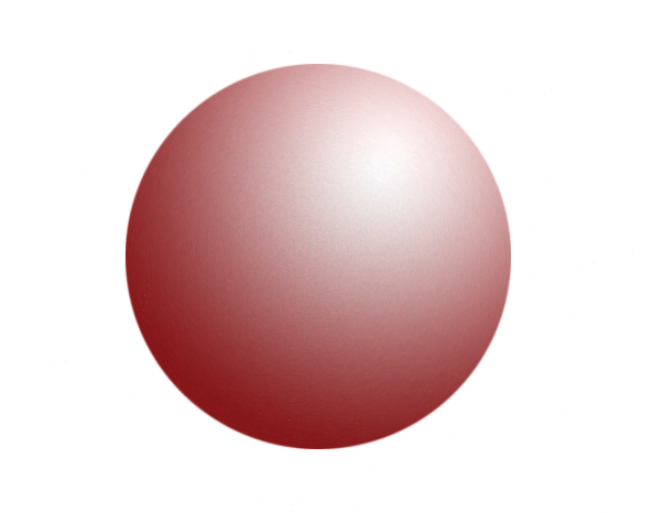
Round N' Round

This is my sphere that I created in Illustrator. I really enjoyed this assignment because it taught be how to create spheres that are unique and useful. I learned how to apply a 3D effect and add a star to add detail and originality. I struggled with creating the sphere and making it how I wanted it to look. I really like illustrator and it was easy to learn how to do this.

Red


This is my red sphere that I made in illustrator. I liked using illustrator better because it was easier and much faster. This was much easier to create in illustrator and a lot more detailed! I learned how to make a shadow and how to make it appear as if there were to be a light source shining on the sphere. I really enjoyed this! 

This is my red sphere that I made in photoshop, I really don't like photoshop but this wasn't that hard. I learned a lot that will help me in the future. I learned more shortcuts and new techniques that will make projects easier and faster. I also learned that spheres are in most everything i will do in graphic design and they are a vital part of the process!

Come Sail Away

This is a music video that we made in my video class. The scope of this project was to create a music video that was a minute and a half long. We first had to come up with what song we wanted to do and the story of the video. We then created a storyboard of all of the shots we wanted. I learned that in order to work as a coherent group, you must listen to everyones suggestions. I would probably not have done this plot with this song if i were to redo this. I would still create the suspense and tone of the story. Finally, my thoughts throughout this video were that we had a good story and good song but our shots could have told the story a bit better.

Thursday, October 2, 2014

KMW est. 1999

My logo represents me because it shows a fun, cheerful, and happy view on life. My process of creating this logo is to start with the image I wanted to portray. I wanted to show that I am happy and upbeat and enjoy doing the things I love. I then started with a flower shape and added color. Once I realized I didn't like that then I added to it and started with an ellipse then rotated copies of that shape to create the base of my logo. I ended up with the flower/sun shape and I really like it. I learned how to make shapes that are not provided and how to incorporate myself throughout the logo. I think I did a really nice job or representing myself and showing my personality and attitude. I think I would change the detail of it and add a little more detail to it. I need to work on the way I create logos and not just jump into the design phase.

Kit Marie Walters est. 1999

When making my font I learned many things such as how to edit a specific letter or part of the font to really make it my own. Something I did really well is that I used color and effects to create a different look and to make it original. I would probably try to do a little more detail and a little more life. I want to learn how to make a grass effect and be able to use it in an easy and efficient way.

Google

When looking at the Google logo I notice many colors and a simple font. The colors represent a fun, calm, and smart theme for the entire website. The red represents excitement and passion. The blue represents peace and stability. The green represents environment and safety. The yellow represents cheerfulness and joy. Google wants to be represented as a universal website and wants to be used around the world. The font is a simple font used to represent the easiness of google and that it shows that anyone can use it.